July 27, 2026
Designing the inVision U Logo: A Student’s Journey
Articles
Useful Information
How the inVision U Logo Came to Life
A logo is more than a visual identity. It expresses what an institution stands for, who it exists for, and what it believes in.
Most universities develop their visual identity with branding agencies. The process usually takes months of research, workshops, multiple concepts, and countless revisions.
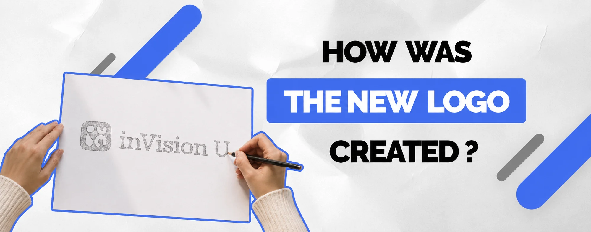
At inVision U, things happened differently. The university's new logo began as a student's sketch on a sheet of paper. She simply decided to contribute an idea-and the university chose to listen.
That fact says more about inVision U than any official statement could. Here, students are not just recipients of education. They are active participants who can shape the university they belong to.
When You Think Your Voice Doesn't Matter
Many young people grow up believing that important decisions are made somewhere above them. Whether at school, university, or in large institutions, initiative often feels secondary. You learn the system before you earn the right to change it. As a result, many good ideas never become reality-not because they lack potential, but because people assume they will never be taken seriously.
inVision U was built around a different belief. Education should not only help students gain knowledge. It should give them opportunities to contribute, experiment, and influence the community around them.
Those values are easy to describe. What matters is whether they are visible in everyday life. The story behind the university's logo is one example.
Aruzhan Didn't Wait for Permission
When Aruzhan heard about the logo competition, she decided to take part. She wasn't a professional designer. No one asked her to create a logo. She simply saw an opportunity to contribute to a university she already felt part of.
Her first design was drawn on paper. She chose the colours herself and tried to capture what inVision U felt like from the inside-not from a brand guideline or a marketing brief, but from the perspective of someone who experienced the university every day.
"I am part of inVision U myself, and every day I see how different this university is from the traditional idea of higher education. For me, it was an opportunity to express how this place feels to someone who belongs here."
How the Idea Took Shape
Looking back, Aruzhan describes the design process as both intense and exciting. She only realised how little time remained before the deadline when she was already deeply involved in another project.
"It all started with a huge rush of adrenaline. My team and I were completely immersed in another project, and I suddenly realised there were only two hours left before the deadline. At the same time, I understood that a university logo is something fundamental-it becomes a symbol that can live for years."
Her first step was to explore the visual identities of well-known universities around the world. Many of them rely on symbols shaped by centuries of academic tradition-coats of arms, shields, books, or trees that represent their history.
Naturally, her first sketches followed a similar direction. But the more she worked, the more she realised that those symbols belonged to institutions with very different histories.
"My first sketches looked much more traditional, similar to the identities of established universities. But I realised something important: those universities were built over centuries. inVision U is being built today. Copying that visual language didn't feel right."
Instead of looking further into academic tradition, she turned to something much closer to home-the philosophy of inDrive, whose founder helped establish the university.
"I decided to build on the DNA and philosophy of inDrive because it represents movement, freedom, courage, and challenging established ways of thinking. Once I combined those ideas with academic symbolism, everything finally came together."
That became the turning point. Rather than designing another traditional university emblem, Aruzhan created something that reflected the university she experienced every day.
"I wanted the logo to communicate movement, openness, energy, and flexibility. I wanted it to reflect a university that grows together with its students and isn't afraid to evolve."
Professional designers later transformed her sketch into the university's official visual identity. What they didn't change was the idea behind it. They preserved the concept, the colours, and, most importantly, the perspective it represented: a student's view of the university from the inside.
What This Means for Future Students
One question comes up again and again when prospective students learn about inVision U:
"Will my ideas actually matter here, or is that just something every university says?"
Aruzhan's story offers one answer. No one asked her to design the university's logo. She wasn't fulfilling an assignment or completing coursework. She simply saw an opportunity, shared an idea, and that idea became part of the university's identity.
For us, that isn't an exception to the rule. It reflects how we believe a university should work. Students should do more than attend classes and complete assignments. They should have opportunities to contribute, challenge ideas, launch projects, and help shape the community they are part of.
Education is not only about acquiring knowledge. It is also about developing the confidence to act on your ideas-and discovering that your contribution can make a real difference.
The story behind our logo is one example of that philosophy in action.
More Than a Logo
At first glance, this may seem like a story about visual identity. In reality, it is a story about participation. It shows that meaningful ideas do not only come from university leadership, faculty members, or outside experts. Sometimes they come from the people who experience the university every day and understand it from the inside.
That is why professional designers did not replace Aruzhan's concept with a completely new one. Instead, they developed her idea into a complete visual identity while preserving what mattered most: the original thinking behind it. For inVision U, this was never about making an unusual gesture.
It was simply a natural outcome of one of our core beliefs: Good ideas deserve to be heard, regardless of where they come from.
Conclusion
Aruzhan's story illustrates what studying at inVision U looks like in practice. The university is built around five core principles: accessible education, unconventional thinking, learning through practice, developing local talent, and connecting education and research to the challenges that matter most in our region.
These principles share one common idea. Education is not something that happens to students. It is something students actively shape through curiosity, initiative, and collaboration. That is why students at inVision U are not simply participants in the learning process.
They are contributors to the university itself. The new logo did not become the university's identity because someone was looking for a remarkable story. It became the university's identity because one student decided to contribute an idea-and the university was ready to listen. Stories like this cannot be manufactured. What can be created is an environment where they happen naturally. That is the kind of university we are building at inVision U.
Final Call
Opportunities rarely arrive fully formed. More often, they begin with someone deciding to take the first step.
If you are looking for a university where initiative is encouraged, ideas are taken seriously, and learning extends beyond the classroom, we would be delighted to welcome you to inVision U.
info@invisionu.education
+7 771 070 73 70
.webp)